6.10. Subscription
Page reading time: 4 min 30
→ Subscription corresponds to an important stage depending on the economic model chosen. It's essential that this journey goes as smoothly as possible for the user and respects their free will. To achieve this:
Don’t push subscription
The user shouldn’t be forced to subscribe to the service.
Users are often encouraged to subscribe using a variety of techniques:
- users subscribe without realising it;
- mandatory subscription to order;
- complicated navigation pushing the user towards subscription.
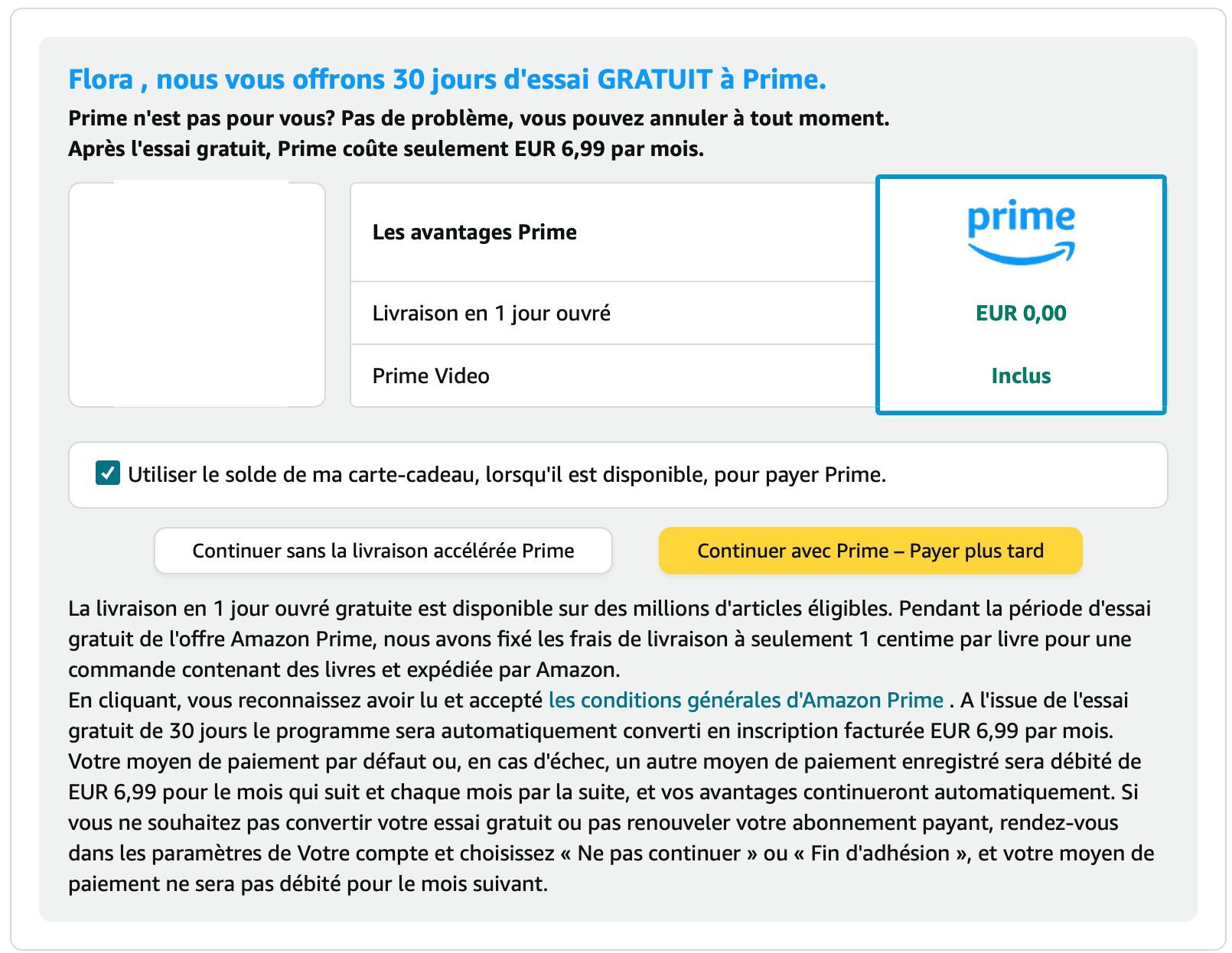
Service forcing subscription
During an Amazon purchase, a button to subscribe to Amazon Prime is added. This button is misleading because :
- It is designed as a primary button (hierarchy);
- The formulation is incentivizing.
The user risks to subscribe without really realising it.

Service forcing subscription
Spotify complexifies the user experience to force subscription. The service increases the number of ads, even though they are not used for service funds. Touting the merits of the premium offer, they are only there to add friction.
Best practices
Users must be able to understand that they are subscribing and be able to choose whether or not to do so.
The service must not make:
- the user experience more complicated than it could be, especially if it's to push the user to subscribe;
- subscription compulsory (when it's not necessary).
Make it easy to exit a subscription
Users must be able to easily unsubscribe from a subscription at any time. Users must be able to easily find:
- information on how to unsubscribe;
- the unsubscribe button.
Section 25 of the Digital Service Act prohibits ‘making the process of unsubscribing from a service more complicated than subscribing to it’.
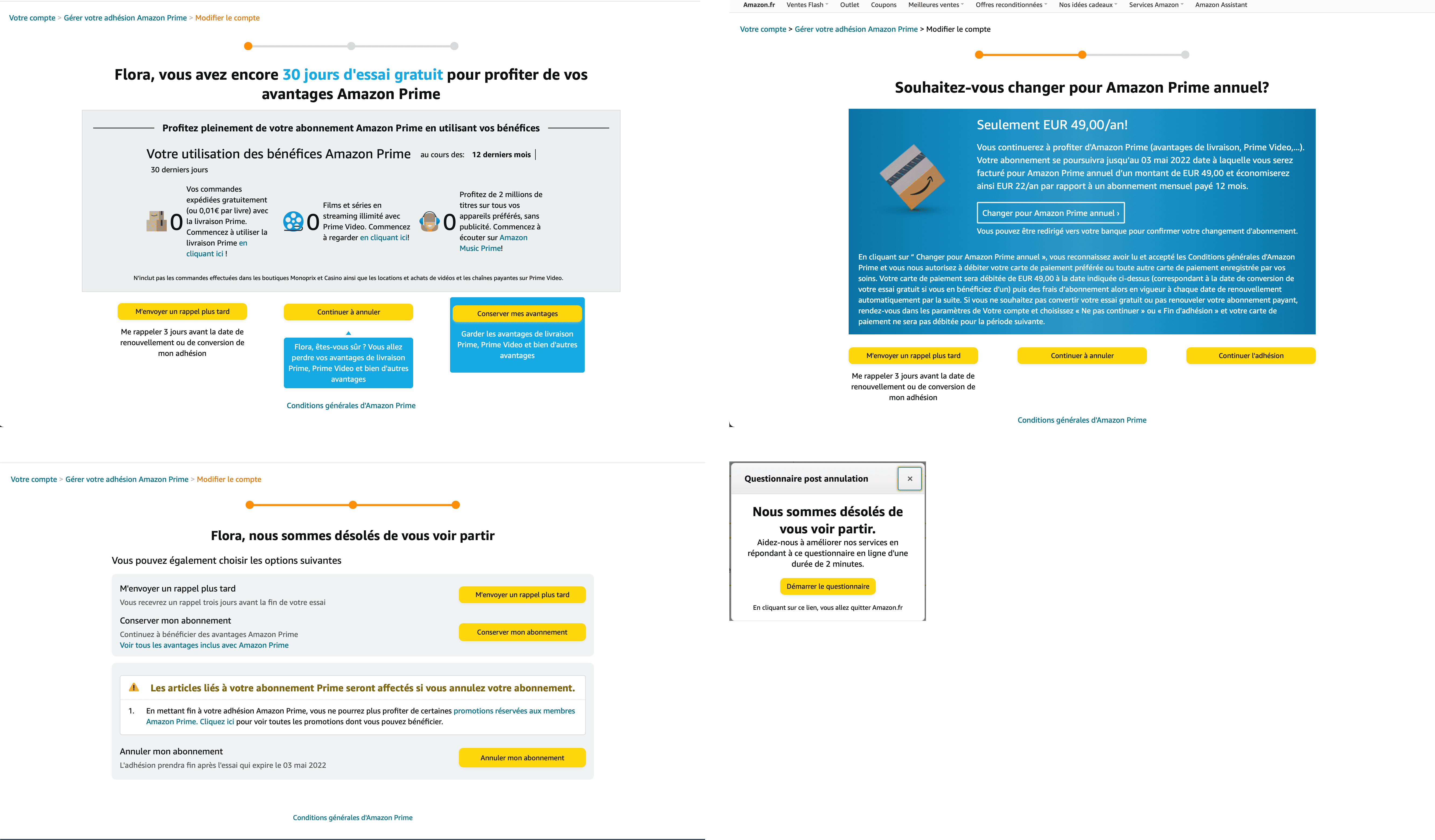
Complex unsubscription
Once the unsubscribe button is found, the user goes through four steps to validate it. The addition of these numerous steps adds friction. They encourage the user not to complete the unsubscribe process.
Case in point: Amazon Prime.
Find out more:
- Website compiling 16 complex unsubscription processes 'How companies make it difficult to unsubscribe de Caroline Sinders' (English)
Provide clarity around future debits
Users must be informed before any debit or direct debit.
This will allow them to:
- be informed;
- choose whether or not to continue the subscription.
This is particularly relevant in the case of the end of a trial period. The user is free to choose whether or not to continue the subscription.