6.2. Text formulation
Page reading time: 5 min 30
→ The way text is formulated reflects the brand image and strategy of a company.
It is essential:
Write in a language level that is understandable
To streamline the user journey, it's important to use vocabulary that is:
- Simple;
- Easily understandable;
- Free from ambiguity.
Ambiguity is used to deceive the user. Upon quick reading, they may understand one meaning, but upon closer examination, the message may convey the opposite.
The use of understandable vocabulary is crucial, especially in areas generating interaction with the user (buttons, forms, etc.). If the user doesn't understand an instruction, they will become stuck. This may prevent them from completing the journey, resulting in a poor experience with your company.
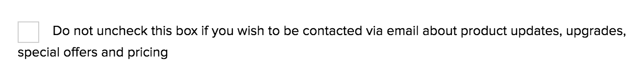
Confusing vocabulary
Square Enix uses confusing vocabulary. The goal is to make users agree toreceiving email marketing campaigns.
Image source: reddit.com
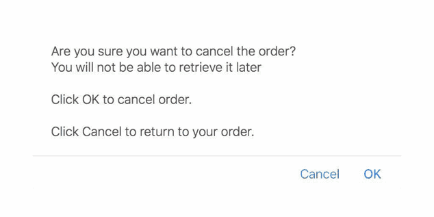
Confusing vocabulary
Here, it is complicated to know which button to click on to withdraw an order.
Image source: darkpatterns.uxp2
Do not use guilt-inducing formulations
By resorting to guilt-inducing language, you are exploiting a technique of mental manipulation. This prompts the user to perform actions they might not have necessarily done initially.
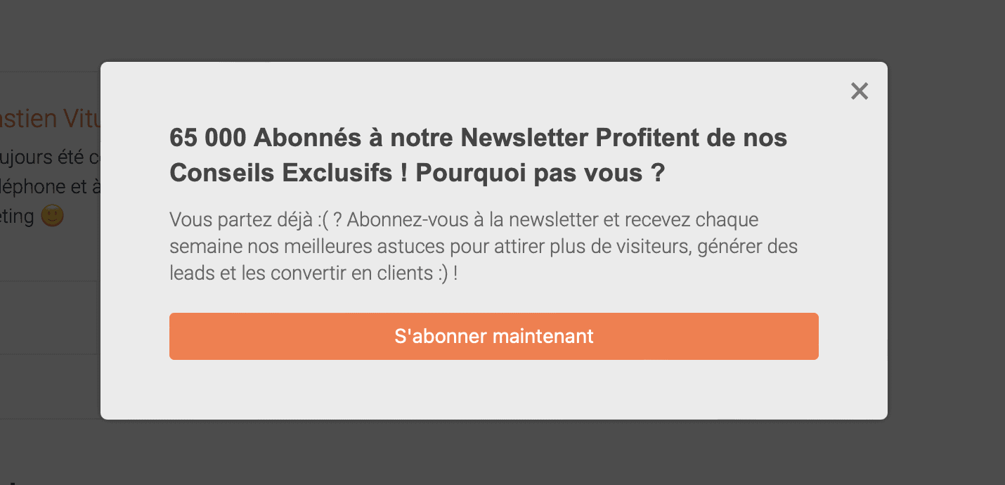
Guilt-inducing message
This website uses the text formulation 'Are you leaving already? 🙁 » which makes the user feel guilty. The intention here is to push the user into subscribing.
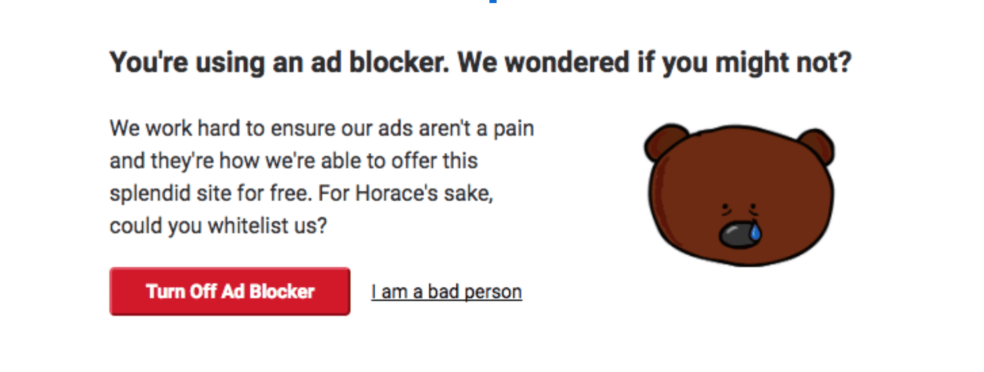
Guilt-inducing message
The user has the choice between:
- Disabling their ad blocker;
- Admitting that they are a bad person.
The goal is to push the user into viewing the advertisements.
source: confirmshaming.tumblr.com
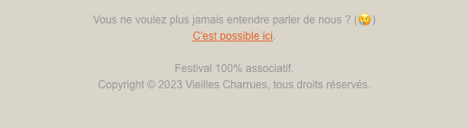
Guilt-inducing message
Here, the guilt-inducing message is used so that the user does not unsubscribe from the newsletter.
Do not push the user to take action
The use of these formulations exploits mechanisms such as:
- loss aversion;
- scarcity bias.
To push the user into doing what the service wants.
This can be used to push the user to:
- Subscribe;
- Continue reading an article.
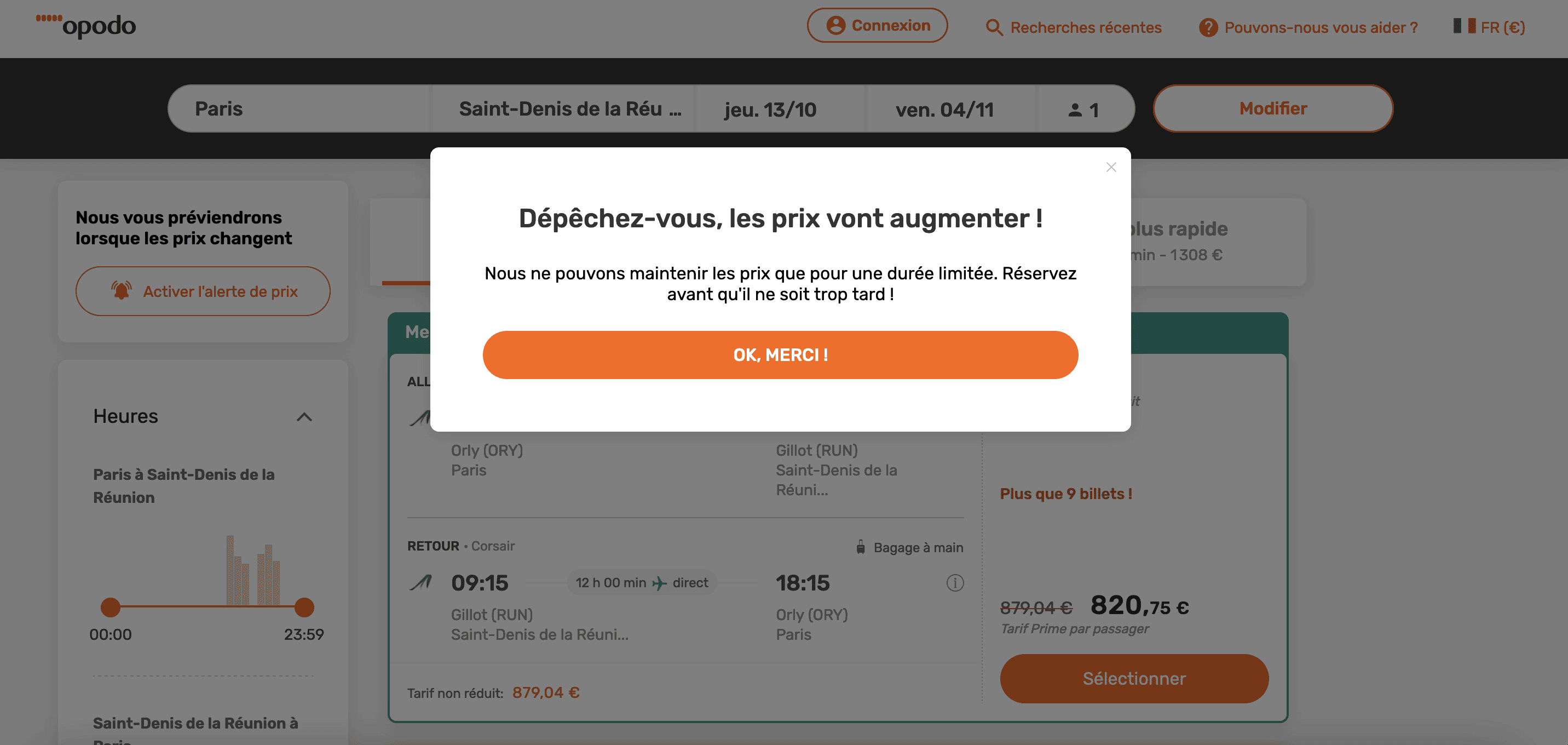
Phrase encouraging the user to take action.
The Opodo website plays on the user's loss aversion. The phrase 'Hurry up, prices are going to increase!' pushes the user to make a purchase quickly..
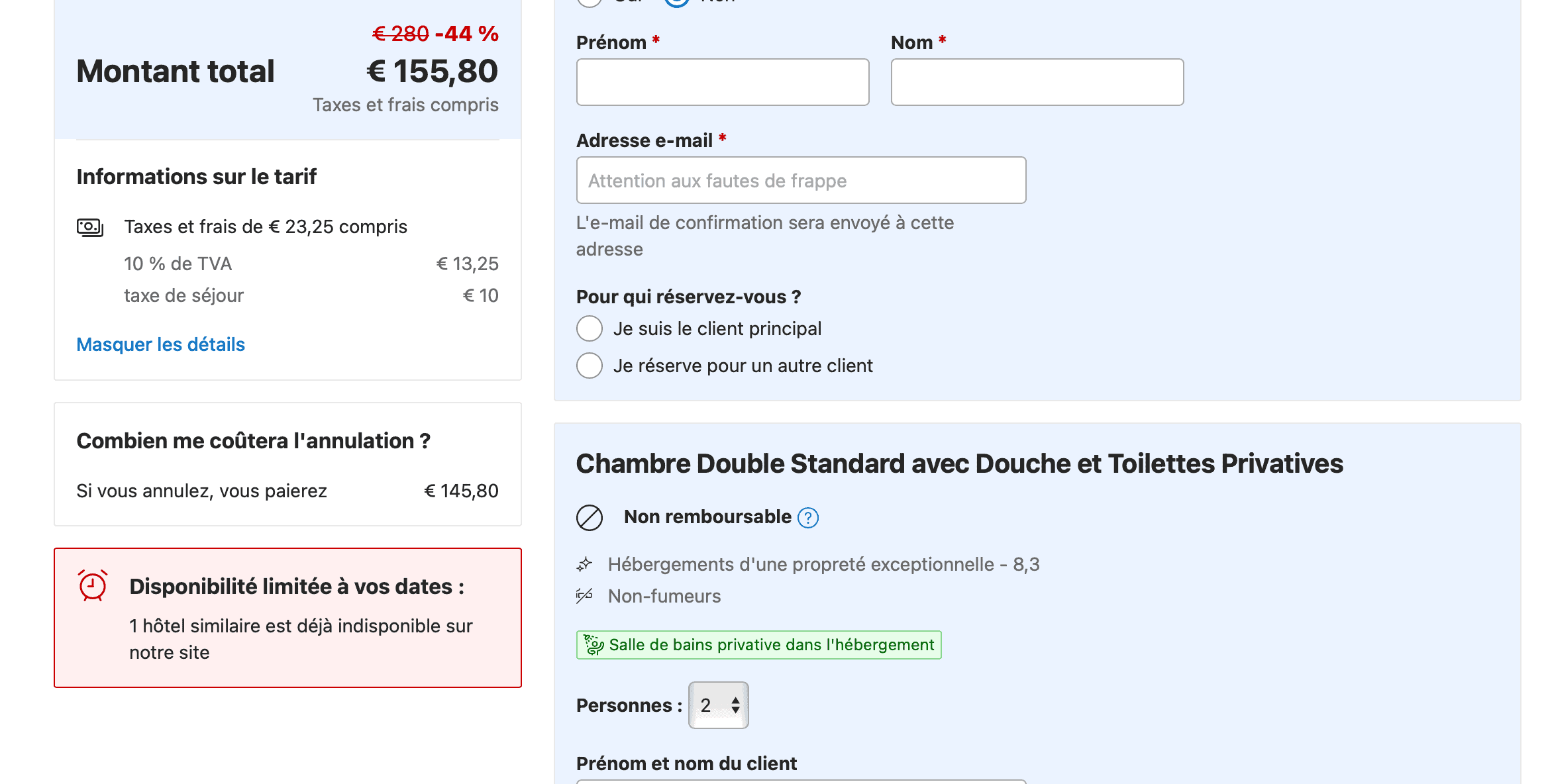
Phrase encouraging the user to take action.
The Booking website pushes the user to book quickly by playing on the scarcity effect. It indicates that similar hotels are already unavailable for the user's dates.
Good practices
- Use factual and neutral formulations: provide information to the user without pushing them to take action;
- Do not visually highlight non-essential elements: avoid using red text and exclamation points that create a sense of alertness and danger.