6.3 Information presentation
Page reading time: 8 min 30
→ The way in which information is presented determines how well it is understood by the user. The designer must make the information as clear as possible without playing on user biases. For this, it is important to:
Do not use the hierarchy of information with the intention of influencing the user.
The information hierarchy guides the user towards the most important elements. This hierarchy must be consistent with the service offered and must not deceive the user.
The DSA prohibits giving more importance to certain choices when the user must make a decision (article 25).
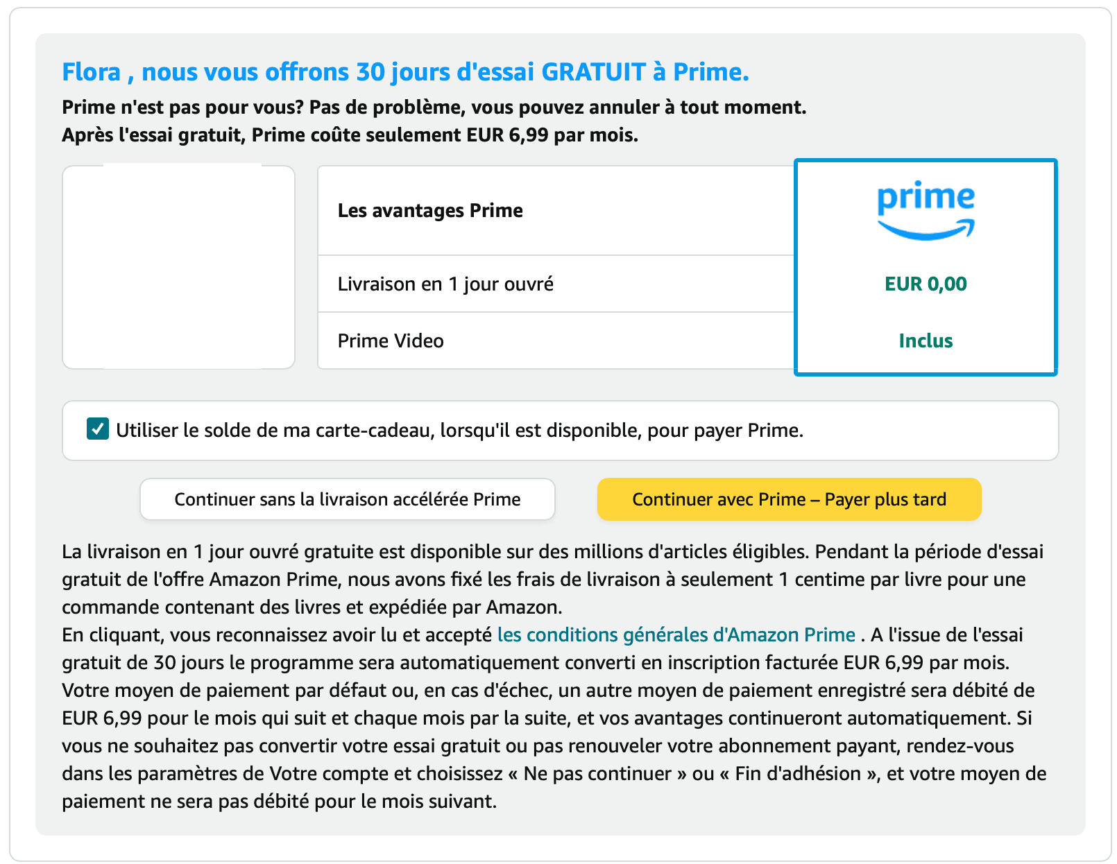
Poor button hierarchy
When making a payment on Amazon, the primary button (black on yellow background) prompts to subscribe to Amazon Prime. The secondary button (black on white background) allows proceeding without subscribing to Amazon Prime's paid service.
The user's initial instinct is to click on the primary button. Consequently, they might unintentionally subscribe to a paid service.
The von Restorff effect suggests that an object that stands out is more likely to be remembered. This effect, used here, encourages the user to subscribe.
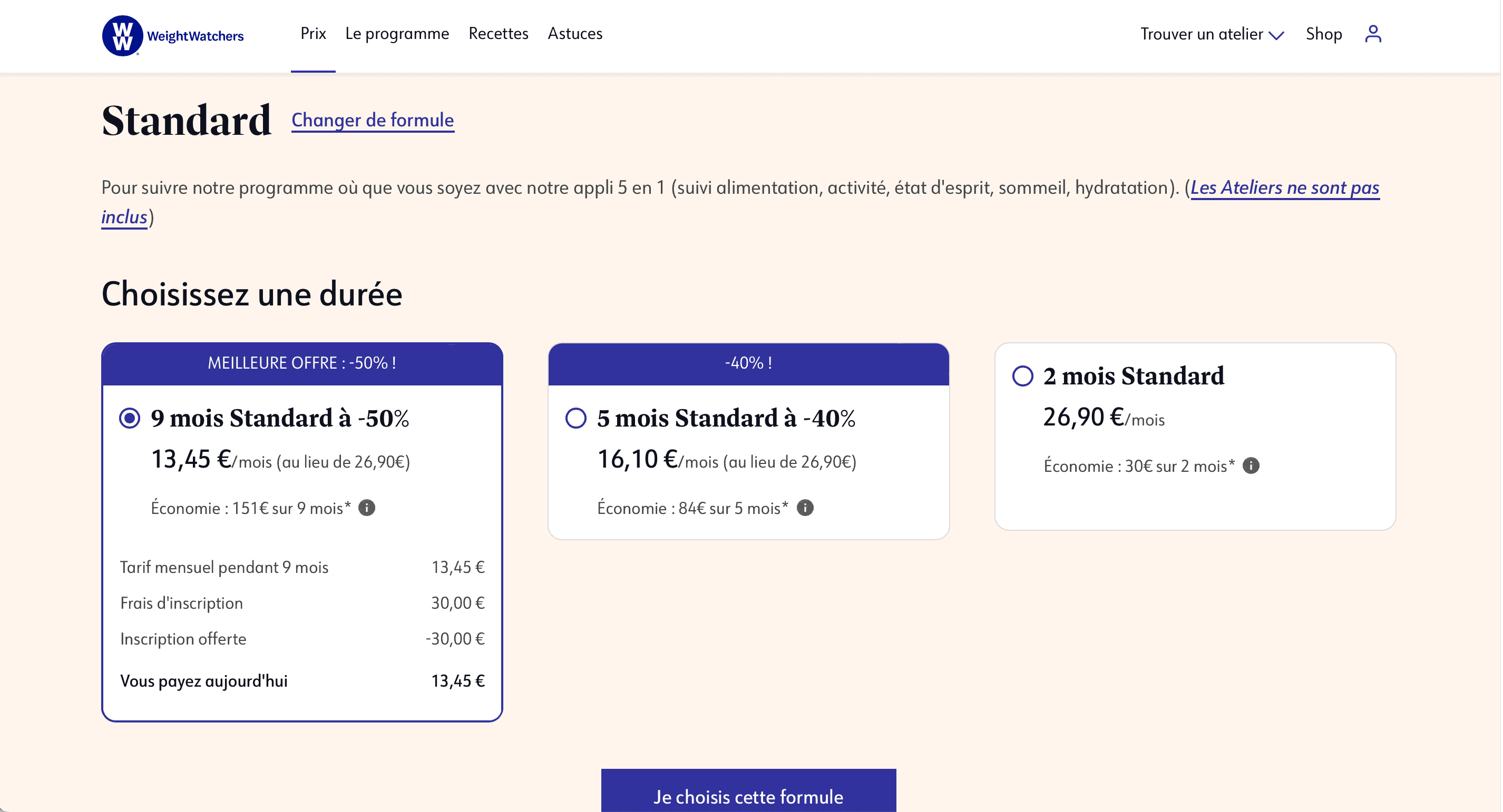
Presentation of subscription prices with emphasis
When choosing the subscription duration, the hierarchy encourages the user to opt for the longest offers. To achieve this, the company:
- Uses a box highlighting the price difference per month;
- Places the longest offers on the left;
- Pre-selects the longest subscription duration.
These elements push the user towards the most expensive and longest subscription option.
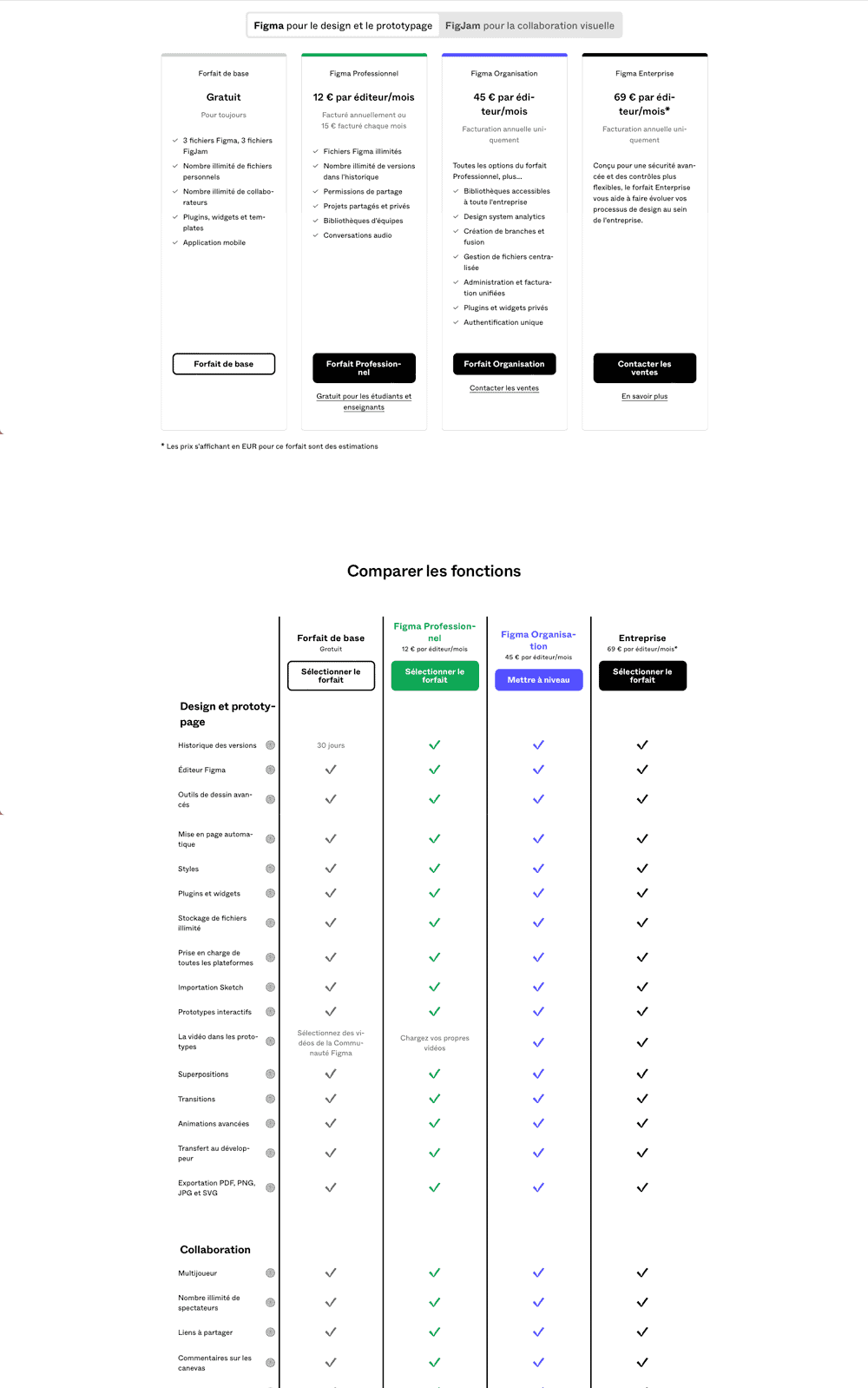
Presentation of subscription prices with minimal emphasis
On Figma, the different plans are presented at the same level. The user can easily notice the elements included or absent in each plan.
The only element that could be questioned is the use of distinct colours for the different plans. Using distinct colours helps visually separate the plans better. However, blue and green shades are more prominent. They highlight the Professional and Organization plans.
Avoiding abusive use of capital letters
The use of capital letters on every word makes reading more complicated than with lowercase letters:
- The eye stops at each letter;
- Absence of ascenders and descenders (parts above and below the body of a letter). These elements form a more recognizable word outline. Example: letters p, b;
- No indication of the start of a sentence.
For all these reasons, reading is slowed down, poses accessibility issues, and captures the user's attention.
Displaying prices and formulas clearly
The price of a product or service offered must be clear and understandable for the user. The prices practised and the possible options must be transparent.
Displaying the details of your prices
The user must be able to have the detail of the breakdown of the price of a product (or service). This detail, accompanied by explanations, allows the user to better understand the value of the different stages of the product (or service), from its creation through its sale to its end of life.
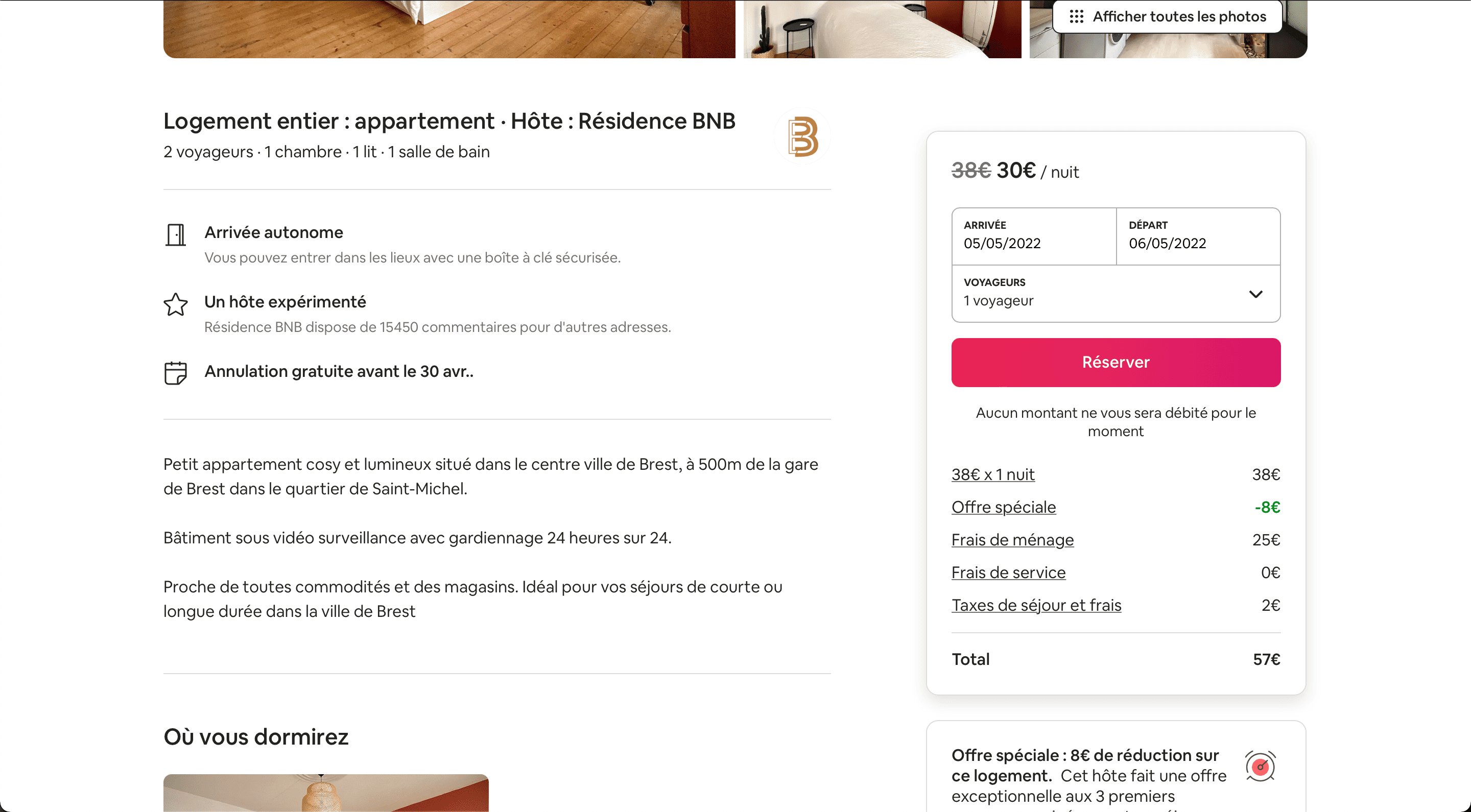
Presentation of price details
The detailed price is displayed at the bottom of the block. However, it is less prominent than the price at the top of the block, representing the price per night before fees.
To prevent the user from being misled, the final price including fees should be the most visible.
Display potential fees upfront
Clearly indicate and display potential fees (such as transportation, insurance, commission, etc.) from the outset. Adding fees that the user was not aware of may lead to a disappointing effect for the customer, making them less likely to return to your service.
Always seek the user's consent before adding a product to their cart
The practice of discreetly adding items to the customer's cart ('Sneak into the basket') should be avoided. Users should be aware of everything they are purchasing and do so freely. The 'Sneak into the basket' practice leads to a disappointing effect for the customer, making them feel deceived by your service. The customer experience will be layered as a result.
Enable comparisons between different offers or plans
Comparisons between different offers or plans should be facilitated. To achieve this, you should use the same names for category elements. This allows users to make decisions that best meet their needs.
Do not emphasise the number of subscribers
From the account owner's perspective
Highlighting the number of subscribers to content can lead to a subscription race. It satisfies the need for social validation, the desire to belong to a tribe inherent in every individual. Each new subscription is perceived as a reward, a social approval, fostering a desire for even more subscribers.
From the visitor's perspective
The number of subscribers can be mistaken for the quality of videos or posts. Therefore, some account owners may resort to purchasing followers to increase their number of subscribers.
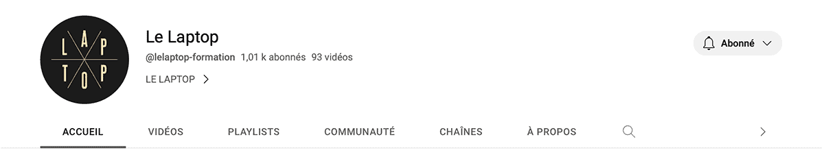
Emphasis on the number of subscribers
The number of subscribers for each channel is highlighted by YouTube and leads to a race for subscriptions among channel owners.
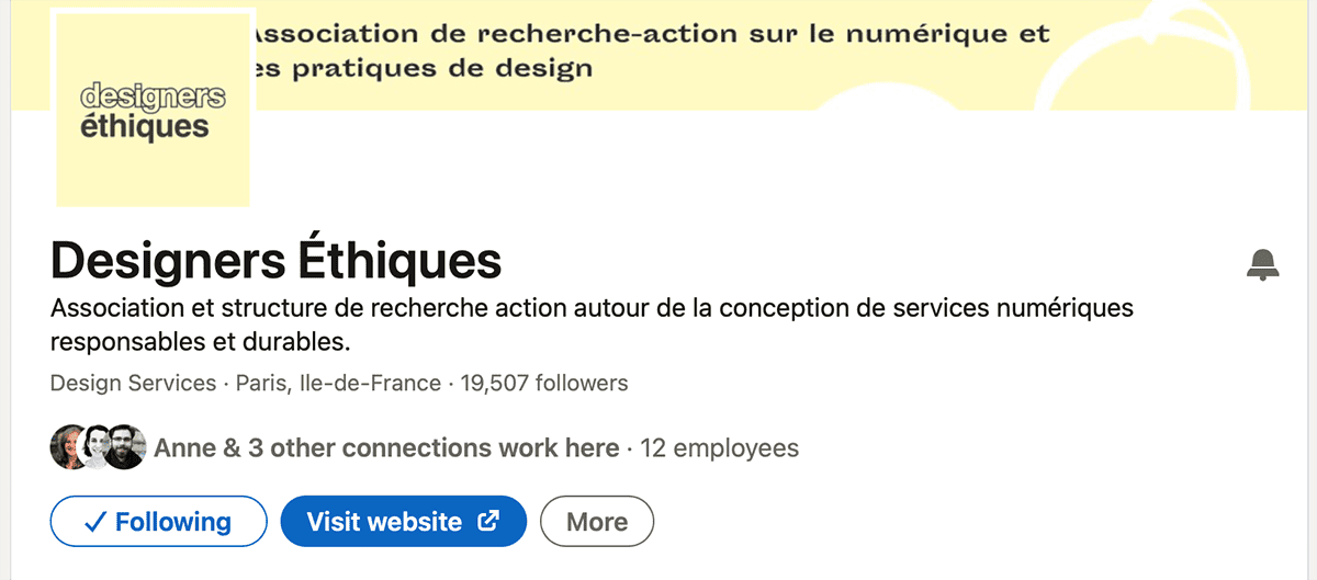
Emphasis on the number of subscribers
LinkedIn highlights the number of followers. Here as well, this emphasis can lead to a race for followers.
Non-emphasis on the number of subscribers
On Bereal, the number of subscribers of a user is not displayed. Users can only see mutual friends.