6.4. Service settings
Page reading time: 6 min
→ Choosing our service settings well is essential for enhancing user experience. .
To achieve this, you can focus on:
Minimal Default Options
The default options of a digital service should be as minimal and unobtrusive as possible for the user. It's up to the user to select more in-depth options as needed or desired.
A user who arrives at your service may not necessarily know where to find the settings to change the options. They will have to take the time to search for the location in order to adjust them in a less intrusive manner, or they may risk being regularly disturbed. These settings require effort from the user and create a poor user experience.
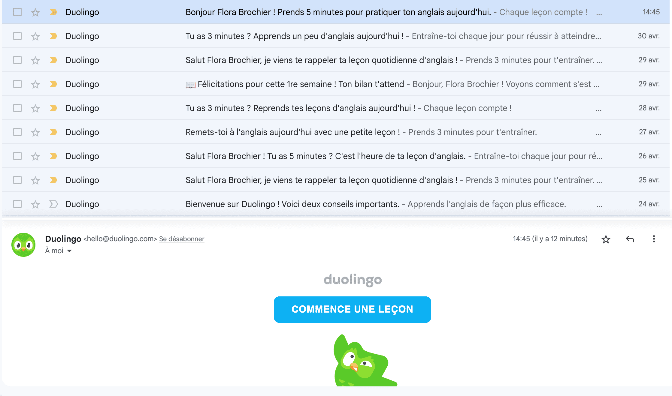
Invasive Default Option
By default, the Duolingo application sends an email to users every day to remind them to complete their language lesson. This proliferation of messages can be poorly received by the user and lead to a negative user experience. Consequently, users may tend to unsubscribe from the application.
Using notifications sparingly
Notifications (push notifications in the case of applications or web push notifications on websites) are meant to alert a user.
It is difficult to determine an average number of notifications received per day. A 2015 Study highlighted an average of 80 notifications per day from an anonymized dataset of 60 users. A 2019 Harvard Business Review article on the other hand, speaks of an average of 46 notifications per day. These figures indicate that an average user receives numerous notifications each day.
Each notification is perceived by our brain as a reward and triggers dopamine release.
A 2014 Mijung Kim thesis, from the University of Michigan showed that notifications influence users to use the application by creating a vicious circle in which users are trapped. Notifications accelerate the visiting routine of an application and anchor this routine in habits.
The use of these countless notifications is not without consequences. Indeed, overuse can result in users abandoning the application. According to site Business of Apps between 2015 and 2017, 6% of users would delete an application after receiving just one push notification per week. It is therefore essential to use them sparingly.
Notifications remain very interesting in certain use cases, as long as they are used judiciously. For example, when:
- Boarding gates are changed shortly before the flight;
- a delivery person indicates the delivery time of the package.
Working on default notification settings.
The default notification settings should allow the strict minimum of notifications, those essential to usage. The user should be able to choose to receive more or fewer notifications of certain types according to their needs and desires. Likewise, the user should be able to schedule time slots or days on which they wish, or do not wish, to receive notifications.
For example, some operating systems, like /E/OS, already offer the option to hide notifications when the user does not check them.
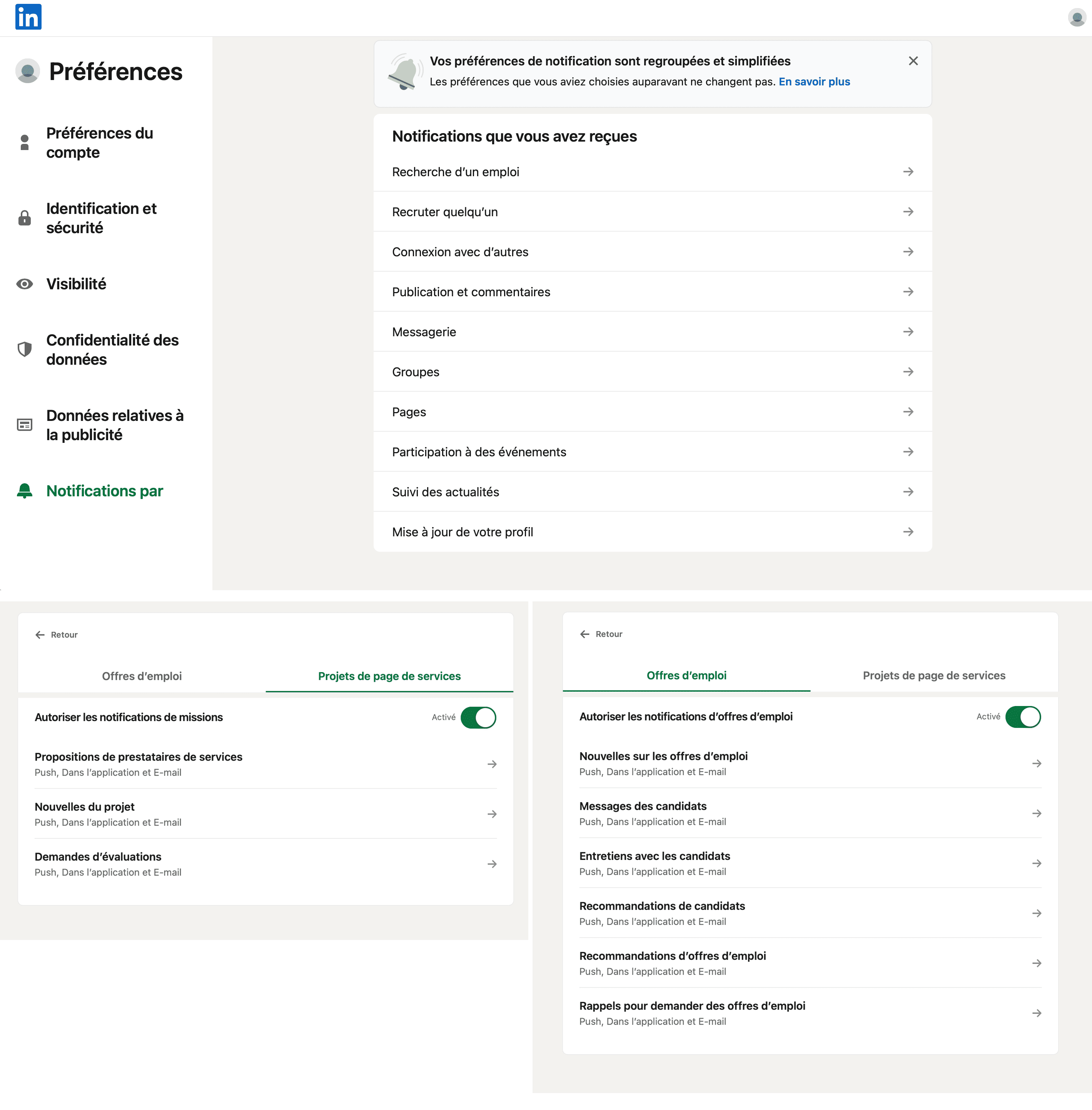
Poor default notification settings
On LinkedIn, notifications are all enabled by default, including in-app notifications, push notifications on the device, and sending an email to the primary address. It is up to the user to manually disable all non-essential notifications.
Notifications provide complete information
The notification should allow the user to have all the necessary information. They should not have to click on it to obtain the necessary information.
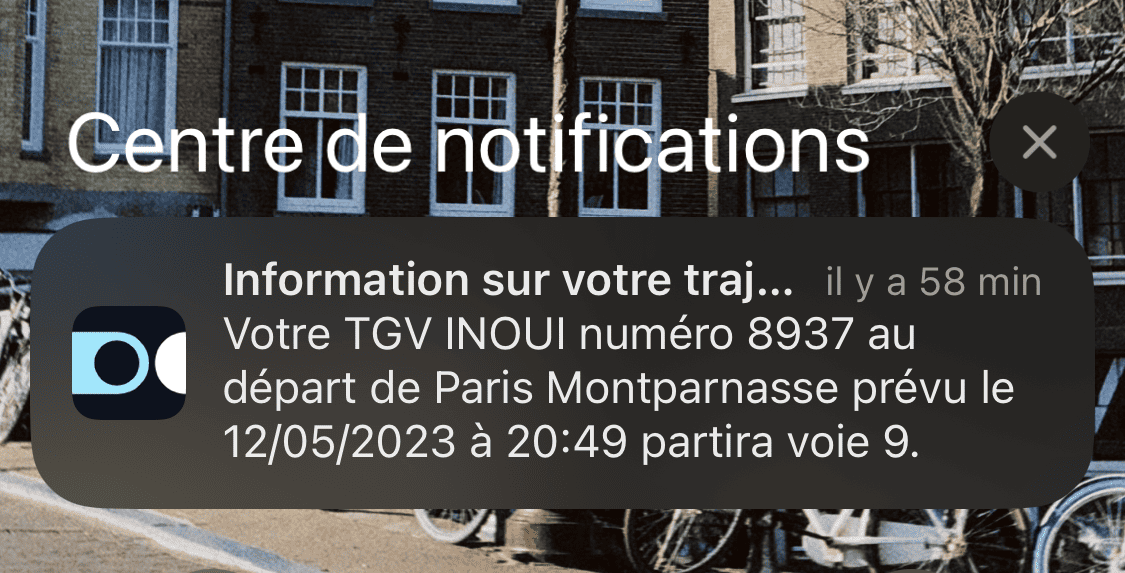
Complete notification
SNCF communicates to the user before the departure of their train (about 20 minutes before) with relevant information (train number, date, time, departure city, and especially the platform).
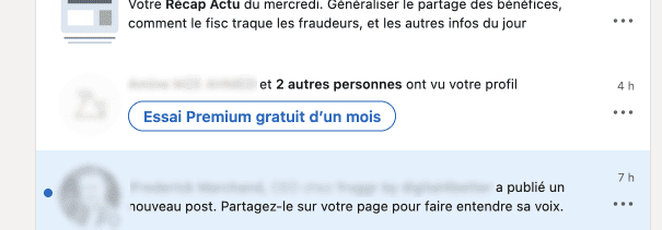
Incomplete notification
LinkedIn indicates to the user the number of people who have viewed their profile by mentioning one or two names. The user must then click on the notification to get more details.