6.7. User interaction elements
Page reading time: 16 min 30
In an interface, many elements are integrated that interact with the user and can be harmful. To be user-friendly, you need to:
Avoiding infinite scrolling
Infinite scroll allows you to scroll endlessly. It was created in 2006 by Aza Raskin to overcome the need to move on to the next page.
Its use tends to increase the time spent on the same page.
Using closure bias and a random reward mechanism, it encourages the user to stay on the service in order to discover, hypothetically, interesting information. In this way, the user can spend 20 min scrolling, as interesting information may be found just after the information that has just been seen. This is the fear of missing out on information, also known as FOMO (fear of missing out).
The massive use of infinite scrolling has led to the elimination of the scroll bar on certain digital services. Without this bar, users lose the notion of beginning and end, and find themselves in a continuous, endless stream of information. In addition, the absence of this bar makes navigation very complicated for many people, for whom scrolling is not intuitive.
There are different types of scroll: search result scroll, chronological content scroll and non-chronological content scroll.
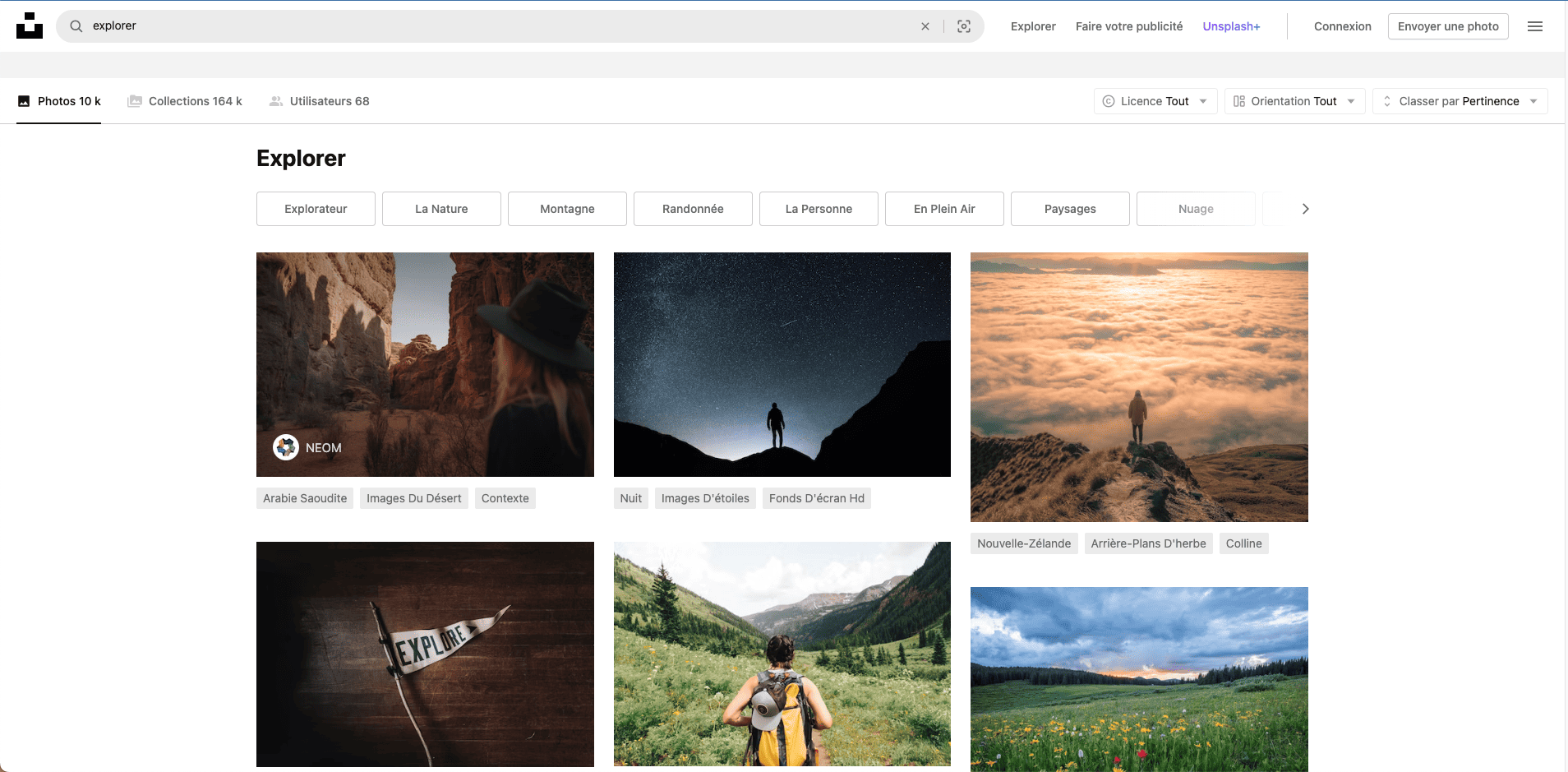
Search result scroll
Unsplash use search result scroll. Search results are displayed below the search bar.
Users will tend to keep looking for a visual, even if they've already found one, for fear of missing a more relevant one. Pagination is preferable to scrolling.
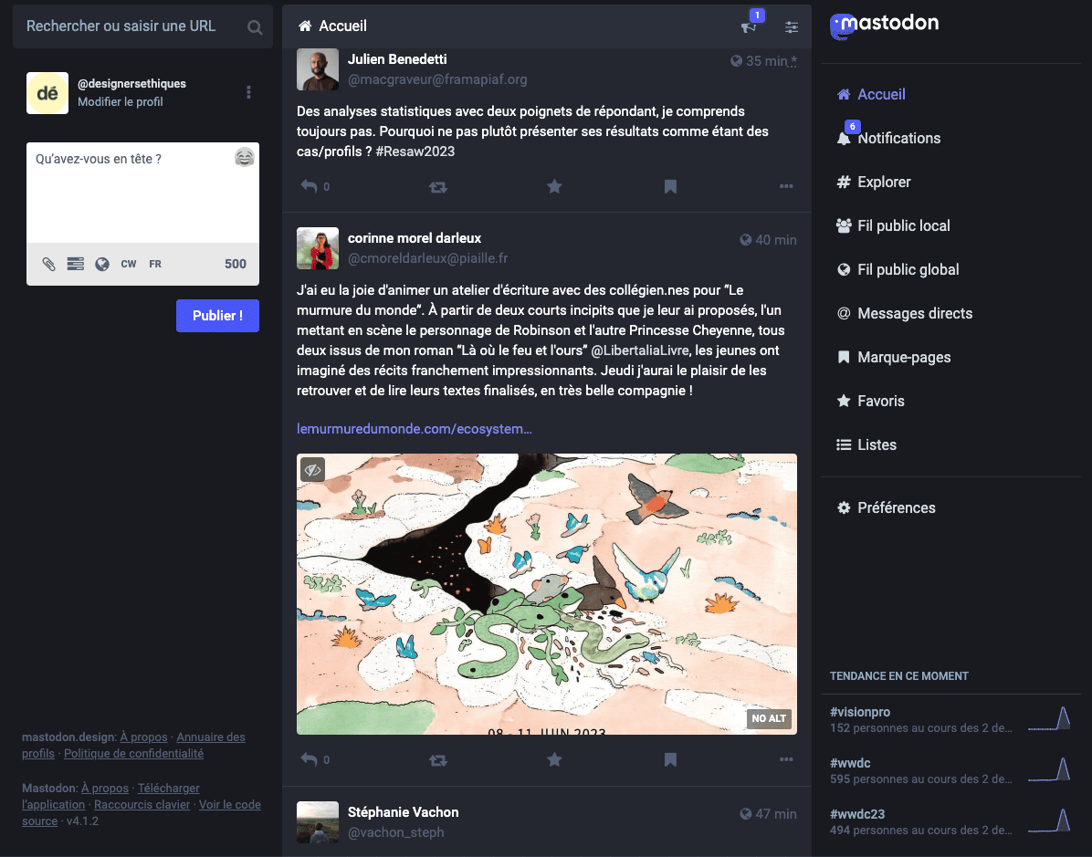
Chronological content scroll
On Mastodon, posts are arranged chronologically. The user first sees new publications or those that have just been reposted.
It's better to visually separate unread content from previously viewed content.
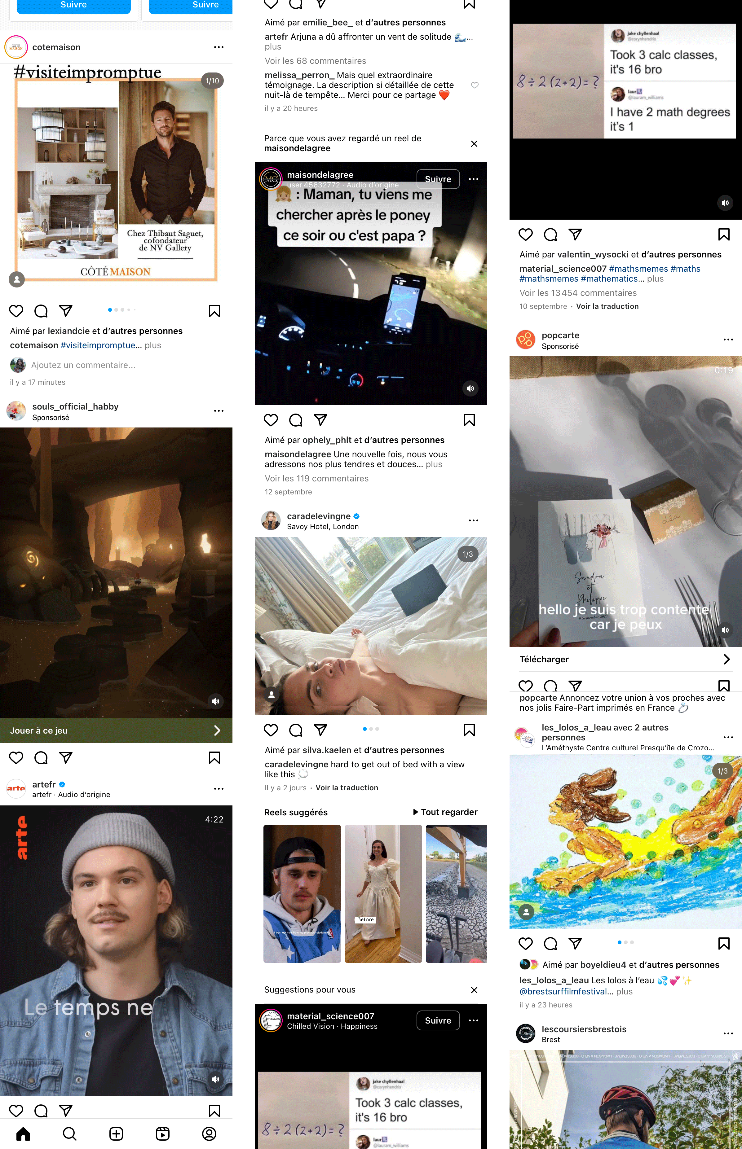
Non-chronological content scroll
Instagram uses scrolling with non-chronological content.
The fear of missing an important post is exacerbated by the non-chronological arrangement of information.
Avoid this type of scrolling. Instead, arrange content chronologically, highlighting unread items.
Why infinite scrolling is harmful
he infinite scroll is compared by its creator to a wine glass that fills up at the bottom. We lose the moment when we ask ourselves whether or not we want to continue reading.
Moreover, the fact that everything is on the same page makes the user lose track of time.
In France, in a proposal 'For an ecological digital transition' tabled in June 2020, the Senate, in article 20, made a motion to ban infinite scrolling. This article was subsequently deleted, and an amendment by the General Assembly in May 2021 (subsequently withdrawn) proposed its reintroduction.
In the United States, in July 2019, Senator Josh Harley (Republican) proposed a law (Social Media Addiction Reduction Technology) to regulate certain dark patterns including the infinite scroll.
Best practices
Favour pagination
The use of pagination allows the user to better situate himself in relation to the quantity of information, and to reduce the amount of information to be read.
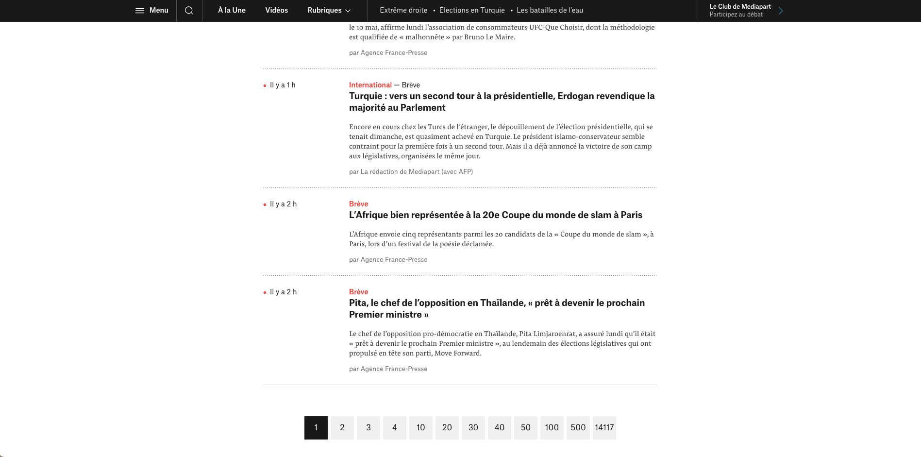
Pagination
Mediapart displays its news chronologically and paginates.
Visually distinguish what's new from what's already been seen
The addition of graphical distinction allows the user to see what's new. This allows them to focus on the new information and limits their cognitive load.
However, this new information should help the user find out what he hasn't seen yet. And it shouldn't push them to immediately consult all new information (as with Gmail's 'New' button).
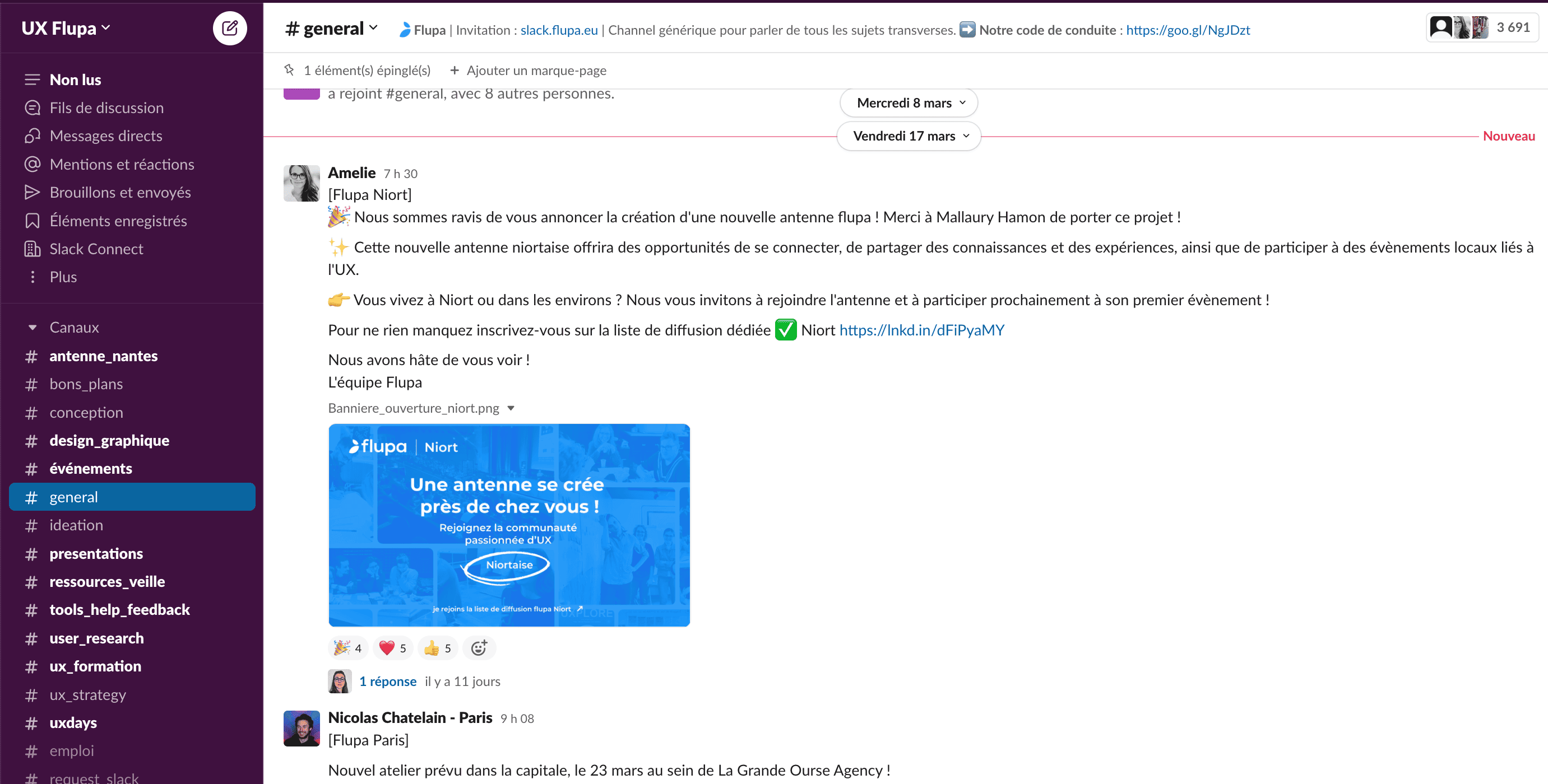
Visually distinguish
In Slack, the red line separates read from unread posts.
Find out more:
Doomscrolling
- By dint of scrolling, we've lost all context on the web by Lucie Ronfaut (French)
- 'Why are we concerned about this practice? What scientific realities underlie it? Are we condemned to scroll endlessly, and does it necessarily harm us?' published by Epsilon, Hors série, July 3, 2022. (French)
Avoiding the use of swipe
Swiping is interacting with a touchscreen by moving your finger sideways or vertically. It is used to scroll through content.
Swiping has several negative consequences for users:
- Addiction
With each swipe, the user receives micro-discharges of dopamine that encourage them to keep swiping. According to a 2014 study on multitasking, cited on the Ledger of Harms site, 75% of the content on our screens would be viewed for less than a minute. Most people would even switch from one content to another every 19 seconds. - Over-consumption
Swiping is an easy way to spend time. Moreover, as there's always another item to follow, whether it's videos (for Tiktok or Instagram) or dating (for Tinder), the user is encouraged to keep swiping. This abundance of content gives the user the impression that there's a risk of missing an important element after the one they're looking at. The mechanisms employed are very similar to infinite scrolling.
Best practices
Replace it with 'card' type elements. These elements don't take up the whole screen, give the user a global view of the number and can be filtered according to the user's needs.
Avoiding autoplay
Autoplay is a process that automatically launches a video without any action from the user. It can be launched as soon as the user arrives on the site, or following a video that has just ended.
Autoplay, which starts as soon as you arrive on a site, is particularly harmful, as it surprises the user and distracts them from what they wanted to do on the website.
After a video, this practice limits the user's cognitive load. They no longer need to think or press a button to start the next video. This leads to several problems:
- Captive user
Users are trapped in the service. They need more conviction to get out of the service. For example, when watching a series, it's hard to stop between episodes. It's easier to continue watching another episode, then another. - Quantity lost
With autoplay, it's difficult to keep track of how many videos you've watched. In the case of a series, for example, you need to know how many episodes have already been viewed. - Time lost
Users are less aware of the time spent on the interface. They can easily spend several hours without realising it.

Interface using autoplay
On Netflix, the show episodes follow up automatically. In this case, the autoplay is very short (lasting less than 5 seconds). It is activated by default in the user settings.
Don’t use autoplay on a website
The use of an autoplay that launches on arrival on a page disturbs not only accessibility, but the attention of the user. It will be diverted from the content of your website.
Good practices if autoplay is inevitable
- Disable autoplay in the default usage settings. Users who want to have autoplay could activate it if necessary.
- Increase the duration of the autoplay button. Allow at least 15 seconds for the users to choose whether or not to watch another episode. They will then have more time to question themselves.
Avoiding captcha
The captcha is an anti-robot security system that asks the user to complete information. It is used to differentiate robots from humans.
Why avoid it ?
Captchas are to be avoided because in addition to accessibility problems related to screen readers and ecology with the download of third-party resources, they pose problems of attention and personal data.
Some captchas collect personal data, requesting confirmation by SMS or email. This is the case for example of reCaptcha from Google which was pinned by the CNIL by its decision MED-2020-015 of 15 July 2020. Indeed, the solution collected a lot of personal information (identification data, payment data, geographical location, etc.).
Other captchas use purpose hijacking by feeding algorithms or external data. This is called free labour. reCaptcha from Google helped Google Books and Street View identify words and street numbers.
In addition, these tools add a layer of complexity to services and require user attention and time.
Best practices
Ideally, avoid using it. If you can’t do without it, choose solutions like Honeypot. This is a form field, visible only to robots and therefore invisible to users.
Find out more:
Use gamification with moderation
Gamification is the integration of game mechanisms in other areas.
Its use makes the activity more entertaining, thus motivating more the user to achieve the purpose of the service. It is used to make the service easier to use thanks to human predispositions to the game and reward system.
This system can be used to assimilate or fill information, watch advertisements, etc.
According to Amy Jo Kim, there are five characteristics of gamification:
- simplified information collection;
- Points gain (especially when given by peers)
- feedback (especially social feedback);
- exchanges;
- personalization.
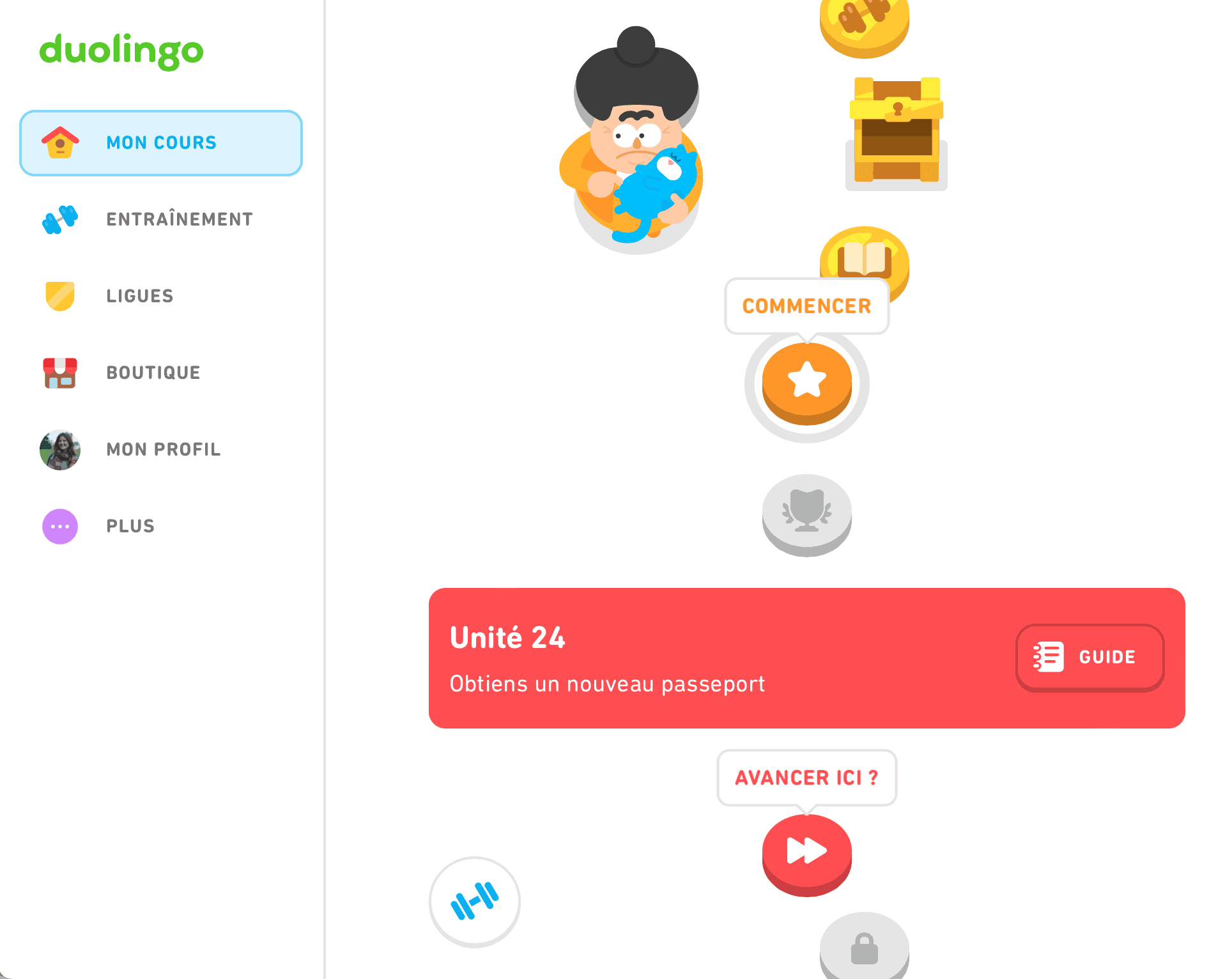
Gamification
Duolingo uses this system to make learning languages more fun.
Why use gamification in moderation?
Gamification uses levers to function, such as:
- the sense of accomplishment;
- the need for recognition (gift, points, etc.);
- the social dimension with interaction with other players.
These mechanisms can lead to a strong dependence on services. This will make it tricky for the user to stop or to accept failure.
Gamification can also lead to deviations from the initial objective of the service. And push the user to do things they wouldn’t normally do. For example, give more personal information.
Last but not least, poorly chosen indicators (of game success) that will be highlighted may be counterproductive for the service.
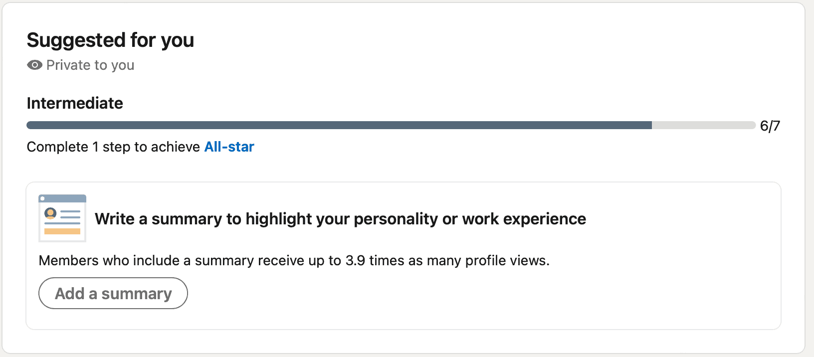
Misuse of gamification
Linkedin uses gamification to push the user to fill their profile.
One of the ways gamification is implemented is by using a progress bar on profile completion.
The objective here is to make the profile as complete as possible so that the company has as much information as possible about each user and offers the most comprehensive profiles and responding to the recruiters' request.
What to watch out for if you use gamification
- Use gamification when it meets a service need. And not because it is a popular tool.
- Ensure that the goal behind gamification is relevant to your service and that your users also have the same goal. Do not use it for financial purposes or for the purpose of recovering information that the user would not give you in a normal setting.
It is essential to remember that gamification is not an end in itself, but just a means of achieving a goal defined and accepted by the service and the user.
Avoiding to push for recurring use
Recurring use is mentioned when the user is prompted to log in regularly in order to get rewards. This method creates a habit in the user’s practice even though the latter had not necessarily expressed the need.
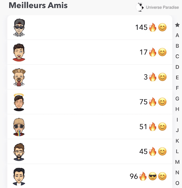
Misuse of recurring use
If the user forgets to log in and send a message for a day, he/she will lose the earned symbol (‘flames’) and go back to zero. With this technique, the Snapchat application pushes the user to log in every day at the risk of losing the reward obtained previously.
What to watch out for if you push for recurring use
If you still use this technique, it is important that the user is aware of the habit created by this service and agrees with its purpose.
For example, if the user uses Duolingo, he is aware that he must connect regularly to learn a language and has the same purpose (learn a language) as the service one. The same applies to an application that supports the user to stop smoking. This application will help the user create a habit allowing him to stop his/her addiction.
A second element to consider is not to create too much loss. If the user does not log in for a certain period of time, do not punish him/her for his/her absence. They must remain free to use your service.