6.8 Interaction elements with other users
Page reading time: 6 min 30
→ Other elements drive interaction with users. In order to respect users as much as possible, you should:
Avoid the use of likes
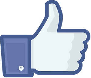
According Carolin Gerlitz et Anne Helmond, 'Like' buttons appeared in 2000 on Digg and Reddit. They then became popular on Facebook in 2009, illustrated by a blue thumbs-up. The subsequently emerged on a multitude of platforms from YouTube, Instagram to Twitter, taking different shapes such as stars or hearts.
Originally, likes were only used as a validation system. There was no identification of the users who liked, nor the number of likes.
The data of people who had liked content was not used by algorithms. It did not condition what users saw.
It was soon used as a reward (see Hooked by Nir Eyal).
Users were drawn into a race for likes. Likes respond to a need for social validation, which is a fundamental human need.
- User A publishes content (social integration action)
- User A 'Likes' another user B's content (group integration action)
- Other user B is likely to like one of user A's posts (as we tend to like those who like us, we feel obliged to like: social validation feedback loop)
- User A receives a 'Like' (social reward)
But nowadays, likes are used to increase user engagement by offering them tailored content. Based on what the user has already liked, the interface highlights other content that the user might like (see section on recommendation algorithms).
Minimised likes
Mastodon is an example of a service that minimises the use of likes (here 'Add to favourites')
The user doesn’t see the number of people that liked a post. This lack of functionality avoids this 'like race'.
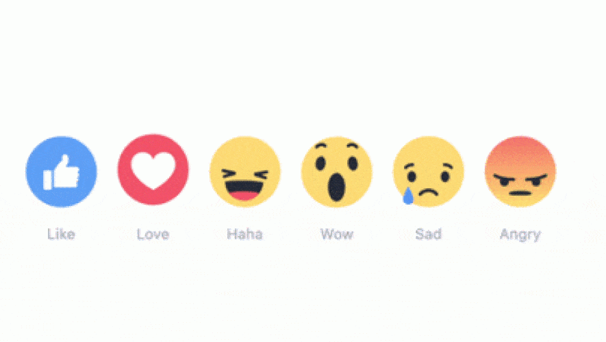
Reactions
Introduced on Facebook in 2016, reactions allow users to showcase the emotions they feel about different content. These emotional likes, use the 6 universal emotions from Paul Ekman: joy, surprise, sadness, disgust, anger and fear. These emotions were then interpreted by companies to create 'reactions'.
Reactions on Facebook
Facebook kept:
- Joy as a laugh;
- Surprise with an emoji saying 'Wow';
- Sadness and;
- Anger.
Facebook has left out disgust and fear and replaced them with like and love.
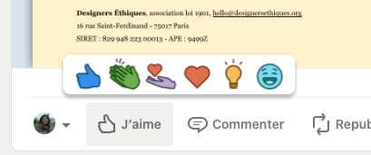
Reactions on LinkedIn
LinkedIn propose to user to select emotions:
- Like;
- Love;
- Celebrate;
- Support;
- Enlightening;
- Funny.
These emotions are slightly different from the original and the Facebook ones. They are focused on the work field.
Why reactions are harmful
The use of likes facilitates the algorithms' targeting work. The data collected is more numerous and more precisely pre-categorized. Users can select different emotions according to how they feel about a post. Previously, users could only like or dislike a post.
This data collection is then monetized. And targeting enables Facebook to offer a specific feed to keep the user on the interface as long as possible.
Don’t encourage sharing
Sharing facilitates the circulation of content between users. Sharing is therefore positive as long as it remains free and chosen, and not imposed on the user.
It is considered problematic when it is forced and conditions access to a content or service.
Inventive sharing
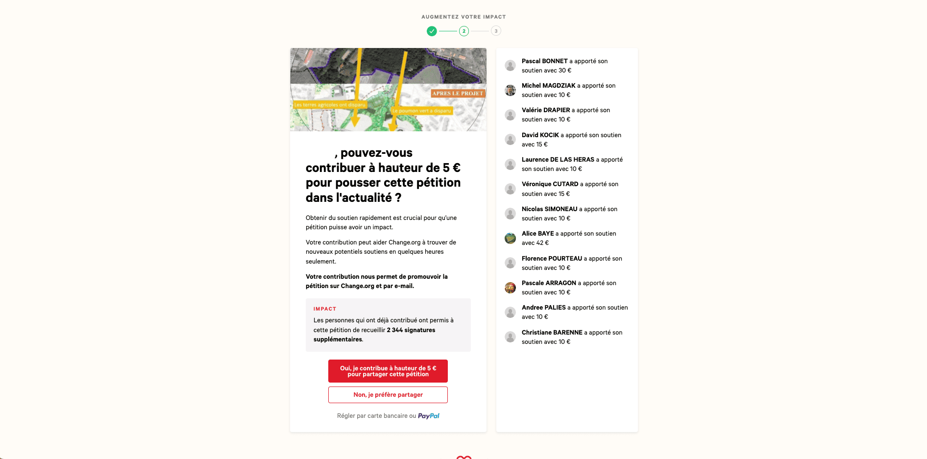
On Change.org website, once users have signed a petition, the service incentivizes to share or contribute financially.
Don’t highlight the number of people viewing the content
Displaying the number of people viewing the content has several consequences, depending on the situation. In the case of :
- Selling: it pushes users to compulsive purchase, scared to miss a 'good deal'.
- Direct viewing: it pushes to a race of views (similar to the race of likes).
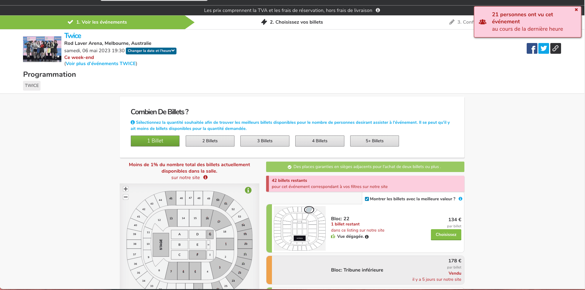
Highlighting the number of people
The Twice site highlights the number of people watching the concert at the same time as us. The user will feel a sense of urgency. They tend to book quickly, without taking the time to think about their needs.